Project Type:
Concept Case Study
Services:
UX/UI · Mobile · Conversion
Overview
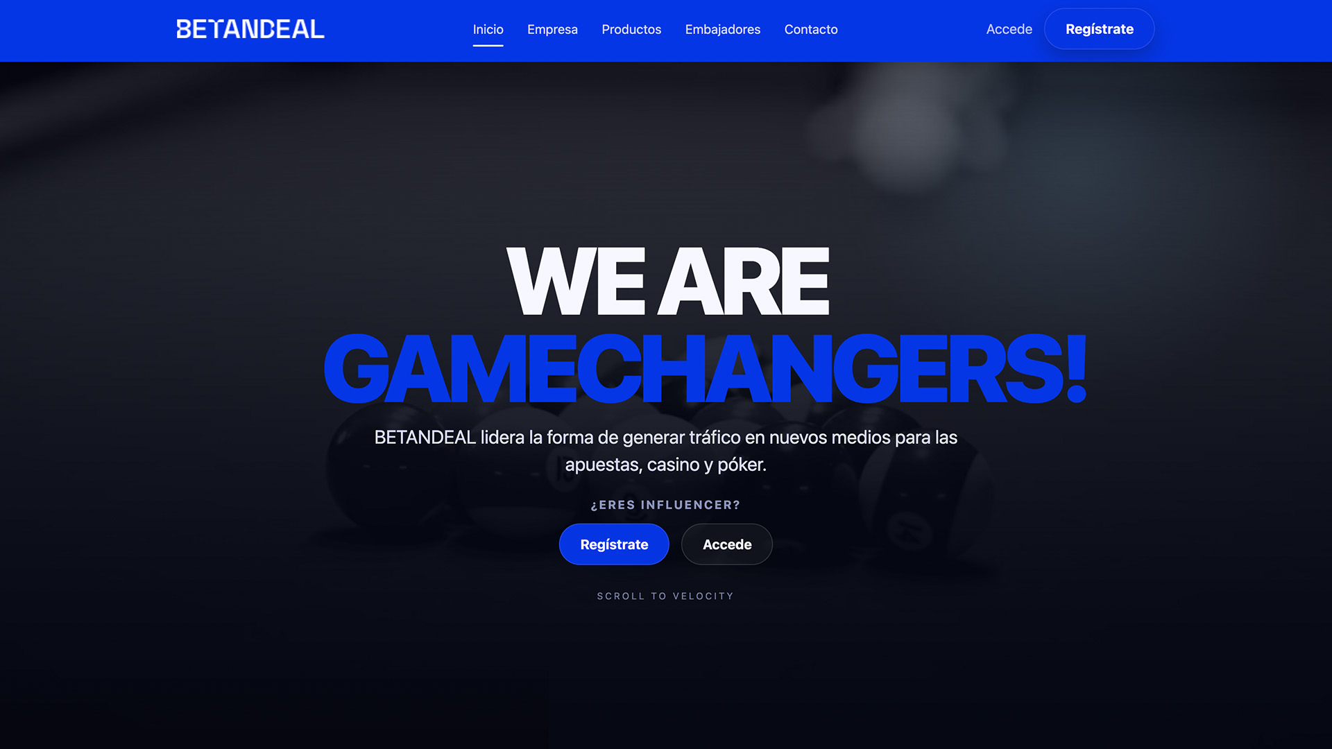
Betandeal – Concept Case Study
is a speculative product concept created to explore how a modern
Betandeal web experience
could look when designed with a
mobile-first
and
conversion-driven
mindset.
The project was designed after my conversation with the recruiter, translating their feedback into a practical proposal built to improve hierarchy, clarity and action flow.
The project was built as a portfolio concept to showcase how I would approach a digital product in the
affiliate / iGaming
space: landing experience, offer discovery, trust signals, and friction reduction across the full journey.
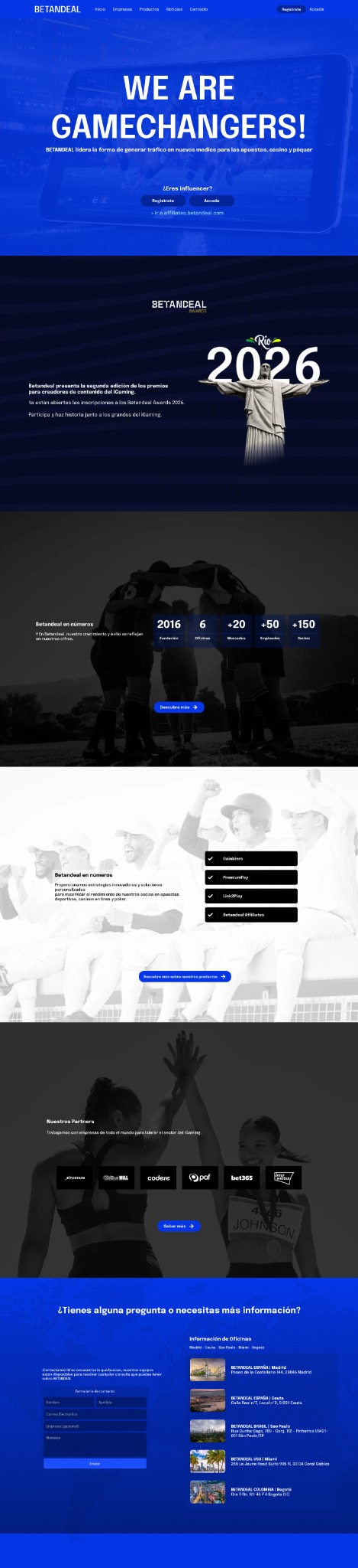
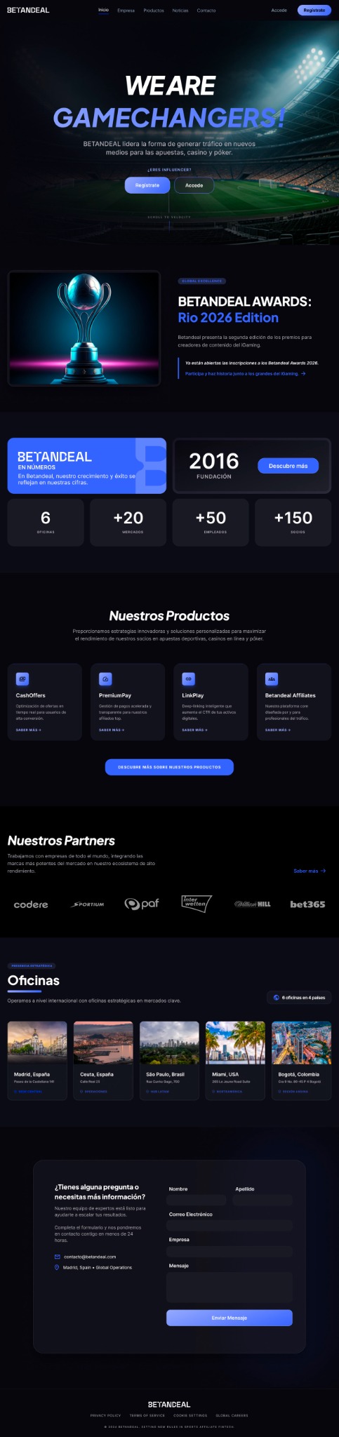
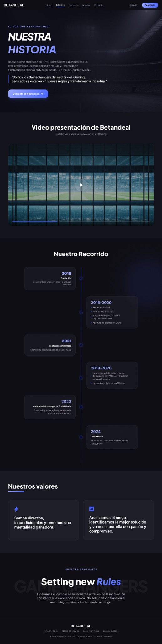
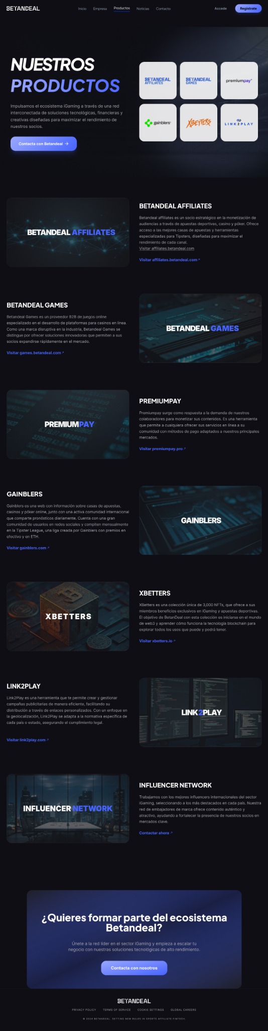
UX Strategy and Interface System:
I structured the concept around a few key principles: fast scanning on mobile, visual prioritisation of the most relevant offers, strong contrast on action buttons, and modular cards that can scale across sports, casino and poker categories.
The goal was to combine
performance marketing logic
with a polished UI layer that feels modern, credible and easy to use.
Challenges
Designing in this category means balancing
clarity, speed and trust
. The interface has to feel attractive and commercial, but without overwhelming the user or hiding the most important information.
Conversion Without Noise:
-
Challenge:
Presenting bonuses, categories and operators in a way that drives clicks without turning the UI into visual clutter.
-
Solution:
A modular card system, stronger spacing rhythm, short microcopy and highly visible CTA buttons with clear visual priority.
Mobile-First Decision Making:
-
Challenge:
Helping users compare offers quickly on small screens where attention is limited.
-
Solution:
Compact information blocks, sticky actions, simple hierarchy and progressive disclosure for secondary details.
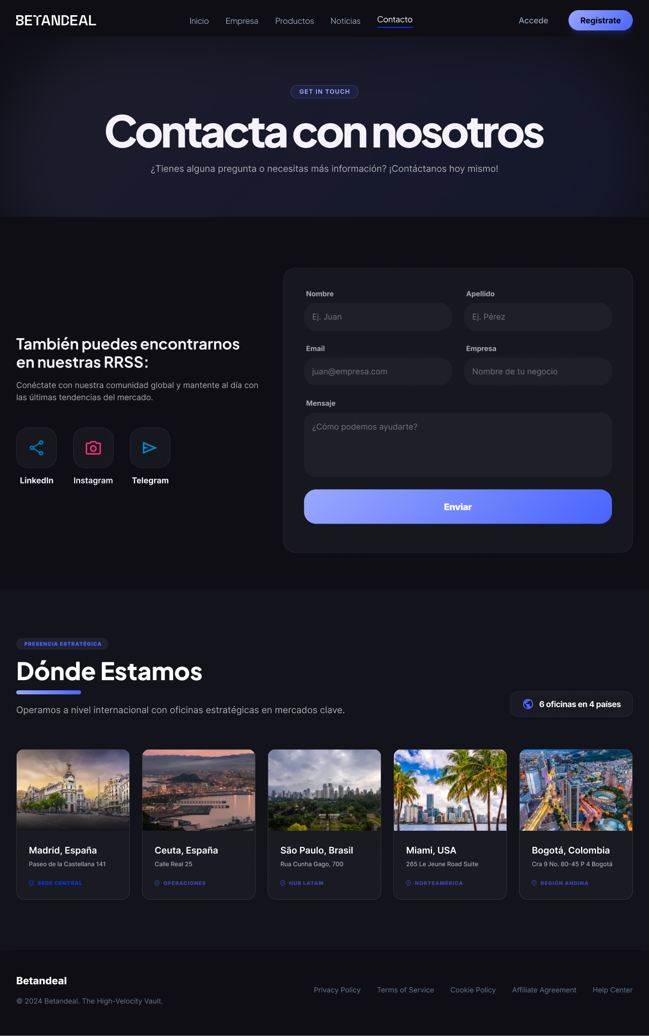
Brand Credibility:
-
Challenge:
Giving the concept a premium, trustworthy feel while staying conversion-oriented.
-
Solution:
A dark UI base with bold blue and green accents, clean typography and dashboard-like components that reinforce a data-led product feel.