Overview
The
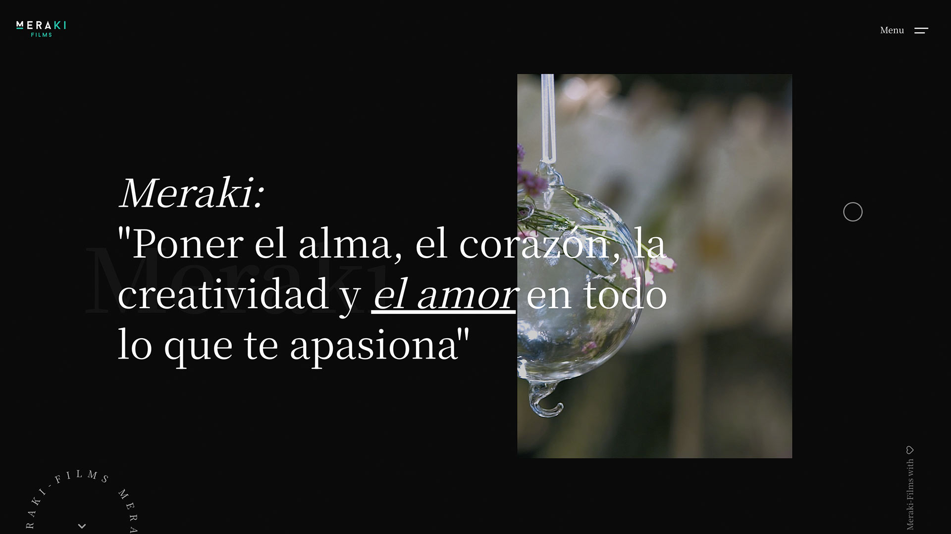
Meraki Films
website was conceived as a cinematic digital experience designed to reflect the studio’s artistic vision and storytelling philosophy.
The goal was to create a portfolio that feels immersive and emotionally charged — merging elegant minimalism with strong visual rhythm to mirror the brand’s cinematic DNA.
Developed entirely with
HTML, CSS, and JavaScript
, the site combines smooth transitions, fullscreen imagery, and subtle motion effects to evoke the feeling of entering a film sequence.
The layout emphasizes wide visuals, clean typography, and fluid navigation, creating a platform that’s not only visually appealing but also fully optimized for performance and accessibility.
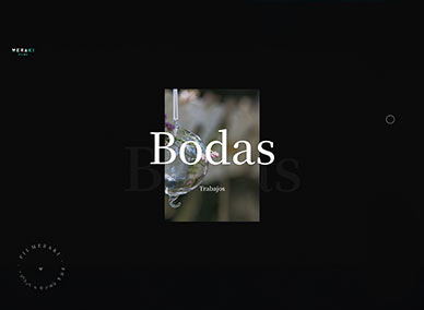
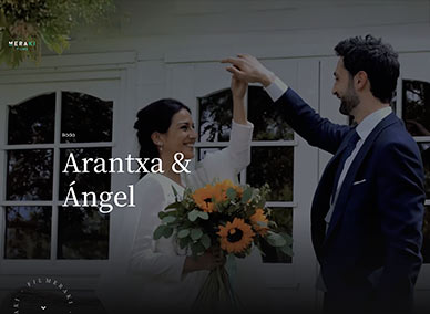
Content and Visual Approach:
The website was designed to showcase Meraki Films’ projects in a visually immersive way. Each section acts as a frame — balancing narrative and image composition.
I focused on maintaining a cinematic hierarchy, where each video or still captures the emotion of storytelling.
Every visual asset was color-graded and optimized to preserve atmosphere and texture across devices, ensuring that the experience feels consistent whether viewed on desktop or mobile.
Challenges
Designing the Meraki Films website required combining technical precision with emotional storytelling.
The main objective was to make every scroll, transition, and element contribute to a cohesive cinematic narrative, while keeping performance, clarity, and responsiveness as top priorities.
Visual Storytelling:
-
Challenge:
Translating the essence of film — movement, light, and emotion — into a static web medium.
-
Solution:
Implemented smooth parallax effects, soft fades, and dynamic image transitions to replicate the pacing and depth of a film sequence.
Responsive Design:
-
Challenge:
Maintaining a cinematic layout and visual balance across different devices and orientations.
-
Solution:
Built fully responsive structures using
CSS Grid
and
Flexbox
, ensuring that aspect ratios and composition integrity are preserved on any screen size.
Performance Optimization:
-
Challenge:
Large images and background videos can slow down loading times.
-
Solution:
Applied
lazy loading
, next-gen formats (WebP/MP4), and minified code to achieve smooth loading without compromising quality.
Brand Identity & Tone:
-
Challenge:
Balancing modern minimalism with the emotional and artistic nature of filmmaking.
-
Solution:
Designed a neutral yet cinematic color palette — black, white, and warm light tones — combined with elegant typography and breathing space to enhance storytelling.
Navigation & User Flow:
-
Challenge:
Guiding users naturally through the portfolio without breaking immersion.
-
Solution:
Implemented smooth scroll, anchor-based sections, and subtle hover interactions that feel intuitive and cinematic, keeping the user emotionally engaged from start to finish.